Bringing a custom shaker bottle design to a manufacturer for the first time tends to go one of two ways. Either the factory says yes to everything — no pushback on the design, no questions about production feasibility, no mention of cost implications until the quote comes back — or the factory gives genuine feedback about what’s achievable at what cost. The first response feels better in the moment and typically leads to more surprises later. Understanding which design elements actually add cost or complexity helps buyers have better conversations with manufacturers before development costs accumulate.
Where custom design requests run into manufacturing reality
The most common gap between what a buyer imagines and what a factory can produce without significant cost premium involves the lid mechanism. Shaker bottle lids are multi-component assemblies with tight tolerances — the flip-top hinge, the seal ring, the spout or mixing grid all have to work together across tens of thousands of open-close cycles. A buyer who wants a lid design that differs significantly from the factory’s existing tooled options is essentially asking for new mold development across multiple components, not just one.
New mold development for a lid assembly with three or four custom components can cost several thousand dollars and take eight to twelve weeks before the first sample is available. That’s not a reason to avoid custom lids, but it’s a reason to understand what “custom lid design” actually means in manufacturing terms before agreeing to a development schedule that doesn’t account for it.
The gradient printing question
Color printing on shaker bottles — gradient finishes, photographic designs, complex color transitions — is a common request that manufacturers handle differently depending on their equipment and process capabilities. Standard screen printing produces clean, opaque colors but can’t reproduce gradients or photographic imagery. Heat transfer printing can handle gradients but requires a transfer film production step that adds cost and minimum quantity requirements. UV printing handles complex imagery but is slower and more expensive per unit at high volumes.
A buyer requesting a gradient design on a bottle body should ask specifically which printing process the factory proposes to use, what the per-unit cost premium is compared to standard screen printing, and what the minimum order quantity is for the printing process they’re recommending. A factory that says “yes, we can do gradients” without any further qualification may be proposing a process that works at their standard pricing only at volumes significantly higher than the buyer’s initial order.
Logo placement and printing area limitations
The cylindrical surface of a shaker bottle sounds like it offers unlimited placement options for branding, but the actual printable area is constrained by the bottle geometry. At the base of the bottle, where the wall tapers toward the bottom, screen printing requires the bottle to rotate in a fixture — the fixture has to grip somewhere, which creates a band near the bottom where printing is impractical. Similar limitations exist near the shoulder, where the transition from cylindrical to tapered creates a surface that doesn’t lie flat against a printing plate.
A design that places a logo or graphic near the bottom quarter of the bottle may be more difficult or more expensive to produce than one placed in the center of the cylindrical section. Getting this information before finalizing the design file — not after — saves the revision cycle of submitting artwork and getting back a note that the placement doesn’t work.
When a specific Pantone color matters
Brand owners who have established brand colors and want those colors matched precisely on a shaker bottle should expect to have a specific conversation about color matching. Screen printing inks are mixed to match Pantone references, but the color appearance on the substrate — the bottle’s surface material and finish — affects the final result. A Pantone color matched on a matte white surface looks different on a glossy surface and different again on a colored base coat.
The correct process is to request a physical color strike-off from the factory before approving production: an actual ink application on the actual bottle surface, matched against the brand’s physical Pantone swatch. Digital proofs and monitor comparisons don’t substitute for this, because monitor calibration varies and doesn’t replicate how the ink looks on the physical substrate.
Working with a shaker bottle manufacturer that has an established color matching process — one that routinely does strike-offs as part of development rather than treating it as a special request — is a signal of production experience with branded customers, as opposed to manufacturers primarily serving generic wholesale channels where exact color matching isn’t a priority.
The measurement window insert
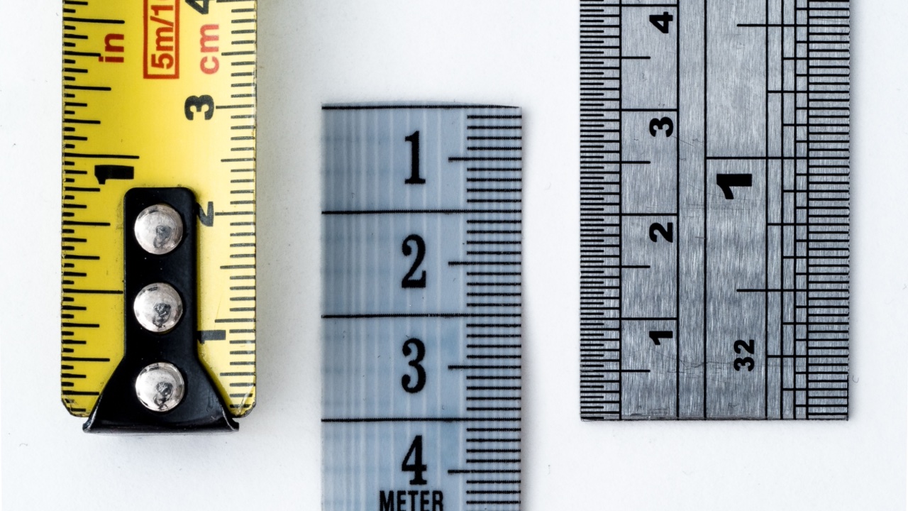
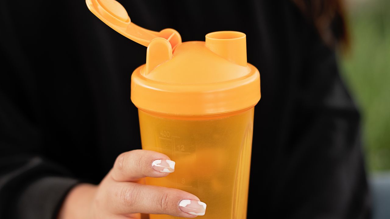
Many shaker bottle designs include a printed measurement scale on the bottle body — oz and ml markings that let users measure ingredients without a separate scale. This seems like a minor design element, but it has a specific production complication: the measurement markings need to be accurate, which means the printing registration needs to be precise relative to the actual bottle geometry.
A bottle body that varies slightly in diameter across production runs — normal for injection-molded components — will have slightly different positions for the same volume marks if the printing is applied at a fixed height from the base. Factories with experience in measurement-window printing have fixturing and registration systems that account for this. Factories without that experience tend to discover it as a problem in the first production run.
The valve or strainer attachment point
Protein shakers with internal strainer baskets or mixing balls have an attachment point for the strainer that is easy to overlook as a design element. The strainer or ball needs enough clearance to mix freely but can’t rattle excessively. The attachment mechanism — if the strainer is attached to the lid rather than loose in the bottle — needs to withstand being pulled open under load without breaking.
Custom strainer designs that differ from the factory’s standard options involve tooling for the strainer itself, testing to confirm the attachment mechanism holds under realistic use conditions, and sometimes iteration if the first version breaks or binds. Buyers who assume the strainer is a commodity component and focus their attention on the bottle body and lid graphics sometimes get surprised when the strainer becomes the development delay.
Understanding these friction points before they appear in development helps buyers ask better questions, set more realistic schedules, and avoid the particular frustration of discovering a production problem after a purchase order has been placed.